Managing the Analysis Display on Your Dashboard
You can leverage your existing analyses to customize your Dashboard, creating views of selected charts, graphs, and related details. By default, the Dashboard tab is blank until you configure your personal settings.
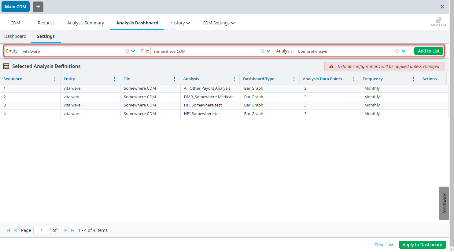
Click Settings in the Analysis Dashboard tab.
Select your Entity, CDM File, and Analysis, and then click Add to List.
Once your analyses are in the Selected Analysis Definitions list, select each one to adjust the Dashboard Configuration. You can select either a Line Chart or Bar Chart. You can also select how many date points to view - either monthly or weekly based analysis points.
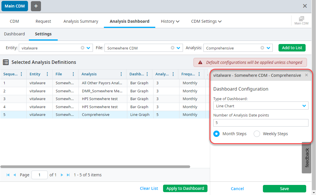
After you configure your analyses, click Apply to Dashboard.
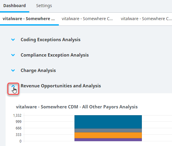
Once dashboard settings have been saved, each separate analysis configuration is viewable in a separate tab for review.
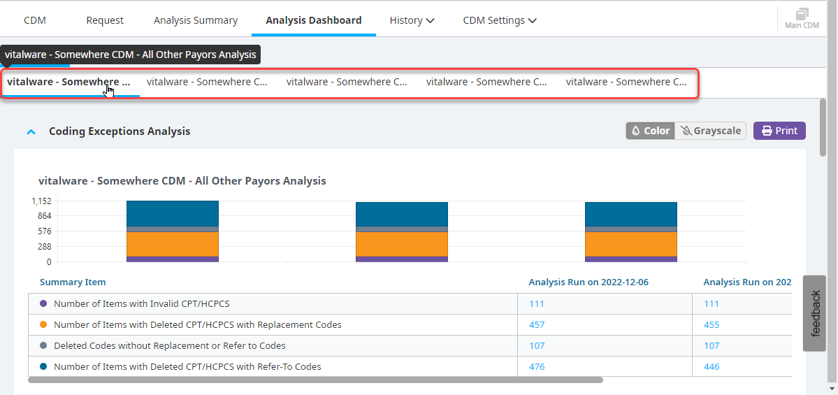
You can collapse each section of the dashboard.